STA 6166 UNIT 1 Section 2 Exercises
Welcome < Begin <

Section 2

< Unit 1 Section 1 > Section 3

Unit 1 Section 2 Exercises

You can choose to work some or all of the problems listed below. We recommend that you at least work the problems listed in your major area of interest. This is a good time to start practicing the use of the computer for helping with your data analysis. Most of this work can be easily accomplished in the Minitab and SPSS and Proc Insight in SAS. With a little practice this can also be easily done in SPlus and R. The graphs, like side-by-side Box Plots may be more difficult to construct in Excel or Quattro Pro. Exercise answers here.

General Questions
  1. What is the difference between a bar chart and a pie chart?
  2. What is the difference between a bar chart and a histogram?
  3. What is the relationship between a histogram and a relative frequency table?
  4. What is the relationship between a histogram and probability?
  5. What is the Empirical Rule?
  6. Does the Empirical Rule always work?
  7. What information can you get from a box plot?
  8. What do the Interquartile range, the range and the standard deviation have in common.
  9. What do the mean and the median have in common?
  10. Is the following histogram left or right skewed?
  11. In the above histogram, would the mean be to the left or to the right of the median?
  12. In the above histogram, would the mean be to the left or to the right of the mode? (Hint look at Figure 3.17).
  13. Which measure of spread would be least likely to be affected by an unusually large measured value: i) the standard deviation, ii) the range, iii) the interquartile range?
  14. Is the 90th percentile value to the left or to the right of the 80th percentile value.
  15. Which of the following boxplots (BP_1 or BP_2) demonstrates a population with larger interquartile range?
  16. Which boxplot in the figure above has a wider range?
  17. Which boxplot in the figure above would have the larger coefficient of variation?


For students in agriculture and environmental fields.

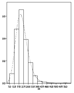
Using the data from Problem 3.65, page 112 in Ott and Longnecker, compute the following statistics. The transmissivity values are transformed by first taking their natural (base e - ln) logarithms (you will need a calculator or computer for this). We will refer to this new (derived response) as the ln transmissivity.

  1. The mean of ln transmissivity for the pilot facility.
  2. The median of ln transmissivity for the pilot facility.
  3. The mode of ln transmissivity for the pilot facility.
  4. The standard deviation of ln transmissivity for the pilot facility.
  5. The coefficient of variation of ln transmissivity for the pilot facility.
  6. The proportion of observations with ln transmissivity greater than 3.0.

With these statistics answer the following.

  1. Without looking at a plot of these data, would you think the histogram of ln transmissivity would show skewness? (HINT: what do we know about the relationship among the mean, median and mode for skewed data?)
  2. Create a histogram for these data. How many bars would you use?
  3. Are there apparent outliers in these data.
For students in engineering fields.

Using the data from Problem 3.55, page 108 in Ott and Longnecker, compute the following statistics.

  1. The mean Deviations from Target for each Supplier.
  2. The standard deviation of the Deviations from Target for each Supplier.
  3. The coefficient of variation of the Deviations from Target for each Supplier.
  4. The proportion of observations greater than 190 in each group.

With these statistics, answer the following.

  1. Is there a supplier that provides a product that is close to the target while also being less variable.
  2. What plot would you use to demonstrate the differences in Deviations from Target among the Suppliers.
For students in toxicology and health science fields.

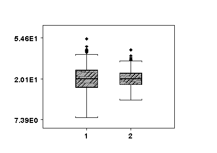
In a study of the accumulation of polychlorinated biphenyls (PCBs) in humans after chronic environmental exposure, Patterson, et. el. (1994, Env. Health Persp., 102, Supp 1, p195-204) reported the following observations for parts per trillion of PCB (lipid adjusted) in adipose tissue from the following two groups (gender unspecified).

Caucasians: 56.7,44.5,48.2,96.5,91.0,34.2,154.0,34.5,41.8,66.4,29.5.49.0,54.7

African-Americans: 36.7, 174.0, 118.0, 69.9, 62.2, 112.0, 42.0, 67.7, 59.5, 36.4, 62.4, 109.0, 84.0, 35.6, 61.6

Using these data compute the following statistics.

  1. The concentration mean for each group.
  2. The concentration standard deviation for each group.
  3. The concentration coefficient of variation for each group.
  4. The proportion of observations less than 50 ppb for each group.

With these statistics, answer the following.

  1. Construct side-by-side box plots of these data. Does it appear that the variation in the two groups are similar?
  2. Combine the data from the two groups and construct a histogram. Do these data appear to have a symmetric unimodal distribution?
For students in community development, education and social services fields.

Using the data from Problem 3.53, page 108 in Ott and Longnecker, compute the following statistics.

  1. The average age for each group.
  2. The standard deviation of age for each group.
  3. The coefficient of variation of age for each group.
  4. The percentage of the individuals in each group less than 50 years old.

With these statistics answer the following.

  1. Which group has the lowest average age? (does this make sense?)
  2. What graph would you use to demonstrate the differences between the two groups? Construct that graph. What does it tell you?