|
STA
6166 UNIT 1 Section 2 Exercise Answers
|
| Welcome | < | Begin | < | < | Unit 1 Section 2 Answers | > | Section 3 | |||||
Unit 1 Section 2 Exercise Answers
Answers to these questions will be posted approximately 3 days after the section is completed in the lectures. For those students in the distance education classes I appologize for "holding you back" by not giving you the answers sooner. Let me know if this is a problem and I will see what can be done about getting the answers to you sooner if you need them to move forward.
| General Questions | Take the Self-Test in WebCt to check your understanding of the concepts presented in these questions. | ||||||||||||||||||||||
|
Using the data from Problem 3.65, page 112 in Ott and Longnecker, compute the following statistics. The transmissivity values are transformed by first taking their natural (base e - ln) logarithms (you will need a calculator or computer for this). We will refer to this new (derived response) as the ln transmissivity.
Output from Minitab
Descriptive Statistics: ln_t

Variable             N       Mean     Median     TrMean      StDev    SE Mean
ln_t                   41      3.402      2.312       3.457        3.537      0.552

Variable       Minimum    Maximum         Q1         Q3
ln_t              -7.191      9.642                1.010     6.373
Mode is undefined since every number is different from every other number. No one number is most often found. Coefficient of Variation = Standard deviation/mean = 3.537/3.402 = 1.039. Proportion with Ln(Trans)> 3.0 = 18/41 = 0.439 With these statistics answer the following.
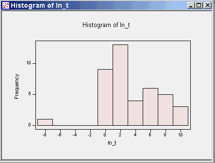
Note that the median is about in the middle of the max and min, but the median is closer to Q1 (lower quartile) than to Q3 (the upper quartile) suggesting that the bulk of the data lie on the low side. The mean is larger than the median, suggesting there may be some large values in the upper tail. These tell me that the data may be a little skewed to the right. There are 41 observations and the range of the data is roughly 17. I let minitab choose the number of bins and it used 10.
Looks like there are some extremely low numbers that do not seem to fit in with the rest of the data. |
|||||||||||||||||||||||
|
Using the data from Problem 3.55, page 108 in Ott and Longnecker, compute the following statistics.
Results for: ex3-55.mtw

Descriptive Statistics: deviations by supplier


Variable   supplier          N       Mean     Median     TrMean      StDev
deviation     1                 9     189.23     189.90     189.23       2.96
                  2                 9     156.28     156.90     156.28       3.30
                  3                 9     203.94     204.40     203.94       8.96

Variable   supplier    SE Mean  Minimum    Maximum         Q1         Q3
deviation     1              0.99     183.80       192.80         186.95     191.40
                  2              1.10     150.90       161.50         153.20     158.25
                  3              2.99     187.10       218.60         198.55     209.75
With these statistics, answer the following.
We want the supplier to have small average deviations from target power as well as small variability. Supplier 2 produces the product with the smallest average deviations, but Supplier 1 produces the product that has smallest standard deviation. Hence there is no one supplier that satisfies both conditions.
|
|||||||||||||||||||||||
|
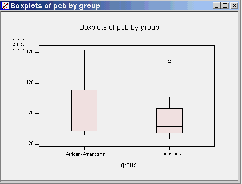
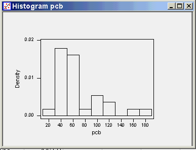
In a study of the accumulation of polychlorinated biphenyls (PCBs) in humans after chronic environmental exposure, Patterson, et. el. (1994, Env. Health Persp., 102, Supp 1, p195-204) reported the following observations for parts per trillion of PCB (lipid adjusted) in adipose tissue from the following two groups (gender unspecified). Caucasians: 56.7,44.5,48.2,96.5,91.0,34.2,154.0,34.5,41.8,66.4,29.5.49.0,54.7 African-Americans: 36.7, 174.0, 118.0, 69.9, 62.2, 112.0, 42.0, 67.7, 59.5, 36.4, 62.4, 109.0, 84.0, 35.6, 61.6 Using these data compute the following statistics.
Descriptive Statistics: pcb by group

Variable   group             N       Mean      Median     TrMean      StDev
pcb        African-         15      75.40       62.40      70.88      38.43
            Caucasia        13      61.62       49.00      56.14      34.46

Variable   group       SE Mean    Minimum    Maximum         Q1         Q3
pcb        African-       9.92      35.60     174.00      42.00     109.00
           Caucasia       9.56      29.50     154.00      38.15      78.70
With these statistics, answer the following.
|
|||||||||||||||||||||||
|
Using the data from Problem 3.53, page 108 in Ott and Longnecker, compute the following statistics.
Well, my hats off to any of you that attempted this problem. It is not a particularly good exercise and I wish now I had not included it. The computations for the statistics requested require that you use the mean and variance equations for grouped data (see page 110 in Ott and Longnecker). In addition, you need to assume the age assigned to each age category is the average age for the group. What do you do for the <29 age group and the >50 age group? These are actually quite difficult questions. Here I have decided to use age values for the age groups at 25, 35, 45 and 55 years. You could do the same problem with other ages for the groups if you had additional knowledge about the true average age in each group. With this assumption, the statistics are:
An Excell spreadsheet showing these computations can be downloaded from here. With these statistics answer the following.
|


